Pantone Color of the Year 2025 - Mocca Mousse
Every year, creatives worldwide eagerly await Pantone’s announcement of the Color of the Year, a hue that sets the tone (quite literally) for design, fashion, and art trends. For 2025, the choice is Mocca Mousse—a warm, earthy brown that feels both comforting and sophisticated.
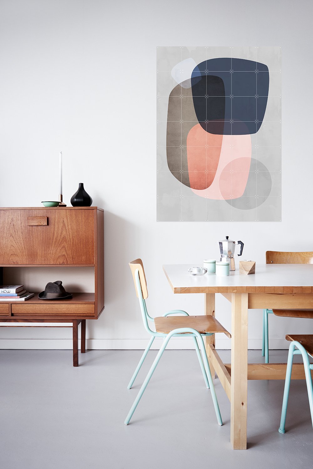
Mocca Mousse (the picture on the left doesn’t show the exact color shade)
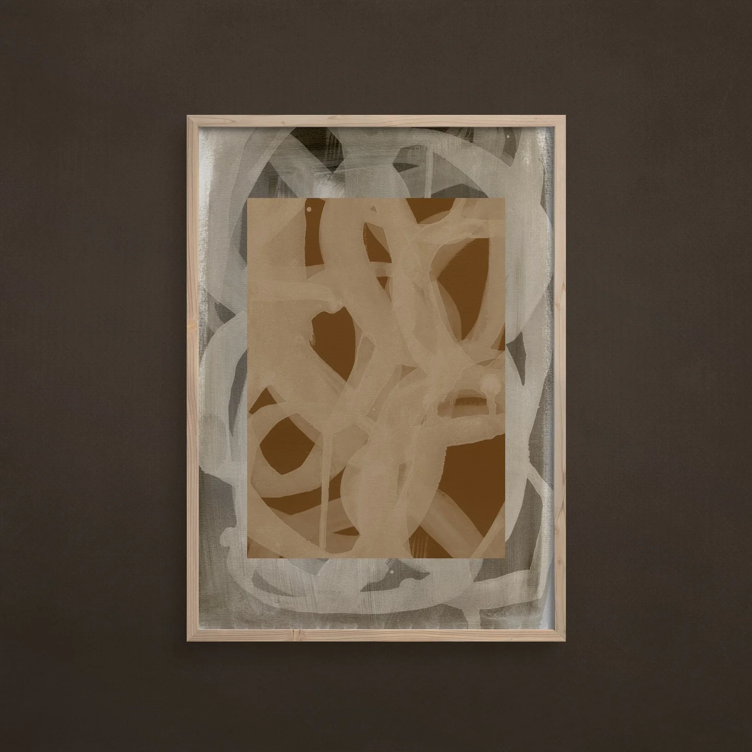
Artwork in the background: My abstract photography artwork “Papers and Shadows 4”
I can’t help but I feel happy about this selection. I like the color, and yes, that’s a simple and very personal statement ;) Compared to some of the colors chosen in recent years—like Greenery in 2017, which I found challenging to embrace and not easy to look at — Mocca Mousse feels timeless and versatile. In fact, it reminds me of one of my all-time favorites, Classic Blue from 2020, which also carried a sense of calm and depth.
Brown tones have often been overlooked in the last years when it comes to the Pantone Colors. Mocca Mousse is not a boring choice, it’s subtle warmth makes it an ideal companion for a wide range of palettes. It pairs beautifully with soft neutrals like beige and cream, but it also holds its own next to brighter, complementary hues such as teal or dusty pink. I can already see the stylings and interpretations that will be published within the next months in interior magazines.
Looking back, many of my artworks have already embraced this tone, even before it was officially crowned. I’ve noticed that earthy hues, especially warm browns, have been quietly trending in the art world over the past few years. They create a sense of calm and natural beauty that resonates deeply with viewers. I’ll be sharing some of my pieces that prominently feature Mocca Mousse in this article, so you can see how it adds depth and warmth to abstract compositions and nature-inspired photography alike.
What are your thoughts on Pantone’s choice this year? Let me know in the comments.


